Franco’s London
Web Design, Creative Direction + Photography
We gave Francos London in St. James’s a full re-brand, as well as a full website redesign to reflect the new look for the restaurant. We provided a refined update which encapsulates Franco’s roots, adapting this classic Italian elegance for a new digital age.
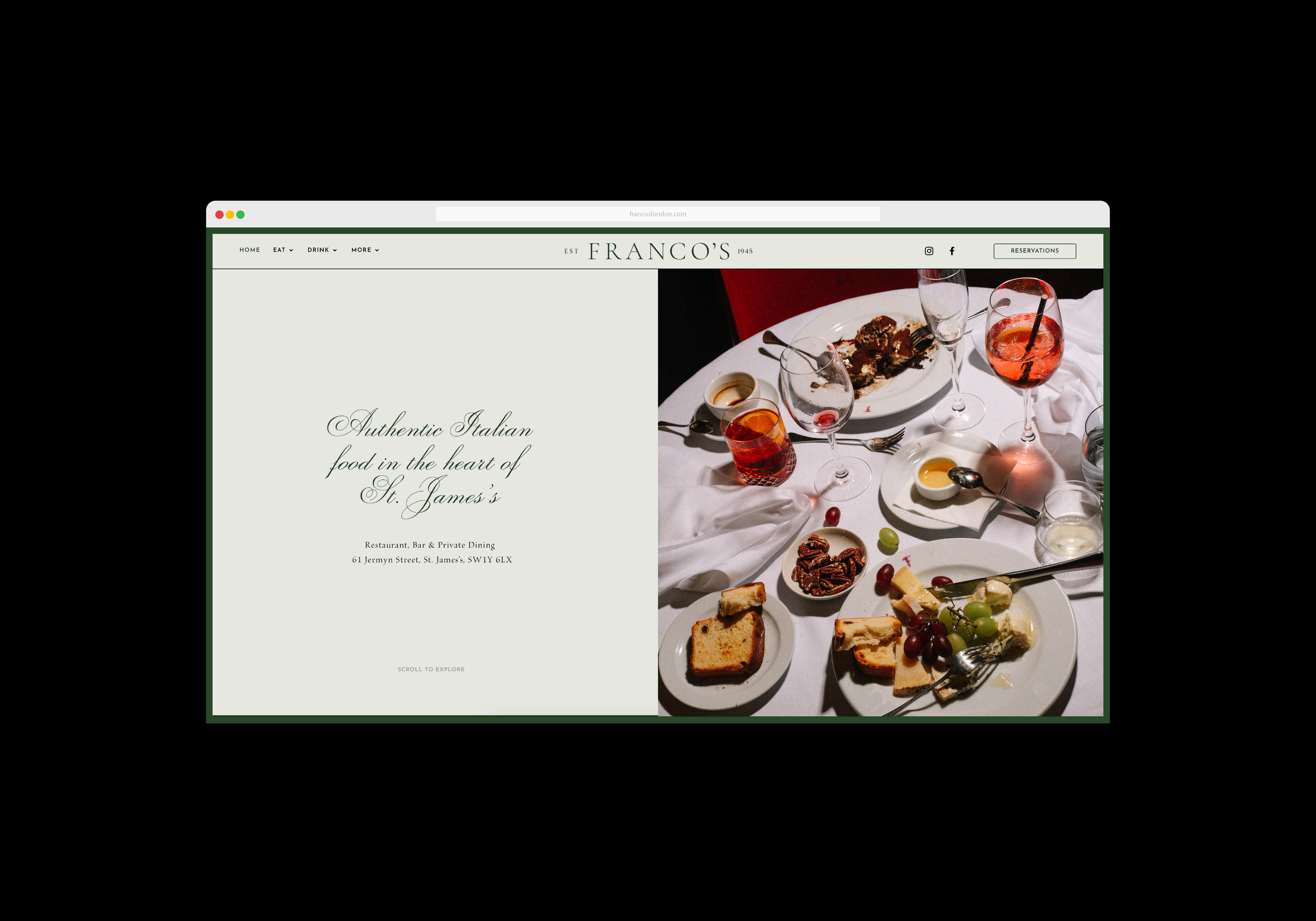

Tastefully paired with photography by James Thompson of FoodFeels, the new Franco’s identity captures the authentic nature of the restaurants heritage. It injects an element of fun, whist retaining its charm and sophistication.
The updated word-mark (below) takes inspiration from the restaurants original facade and signage, combining this with traditional Italian design touches. The Franco’s word mark can be used in several ways, with the main variation encompassing the date of opening, 1945, housed inside the classic European tilted O.
We paired the new word-mark with a beautiful cursive typeface, and a juxtaposing modern sans-serif accent typeface, for when a more detailed version of the word-mark is needed.


The website itself balances the updated branding and imagery, with user-friendly layout, combined with a wealth of negative space and design-flair. The full-bleed imagery paired with subtle green border presents an understated but distinctive touch, with simple animations and transitions encouraging the user to scroll through.


Pairing beautifully with the typography curation, we opted for a heavy use of flash photography, capturing the authentic nature of the ‘old-school Italiana’ that people know and love for Franco’s, one of the oldest Italian restaurants in London.
To communicate the genuine character at Francos, we consciously styled the images less, incorporating shots of messy tables and semi-eaten pasta, embracing food ‘sprezzatura’. Visually describing the good times eating good food.

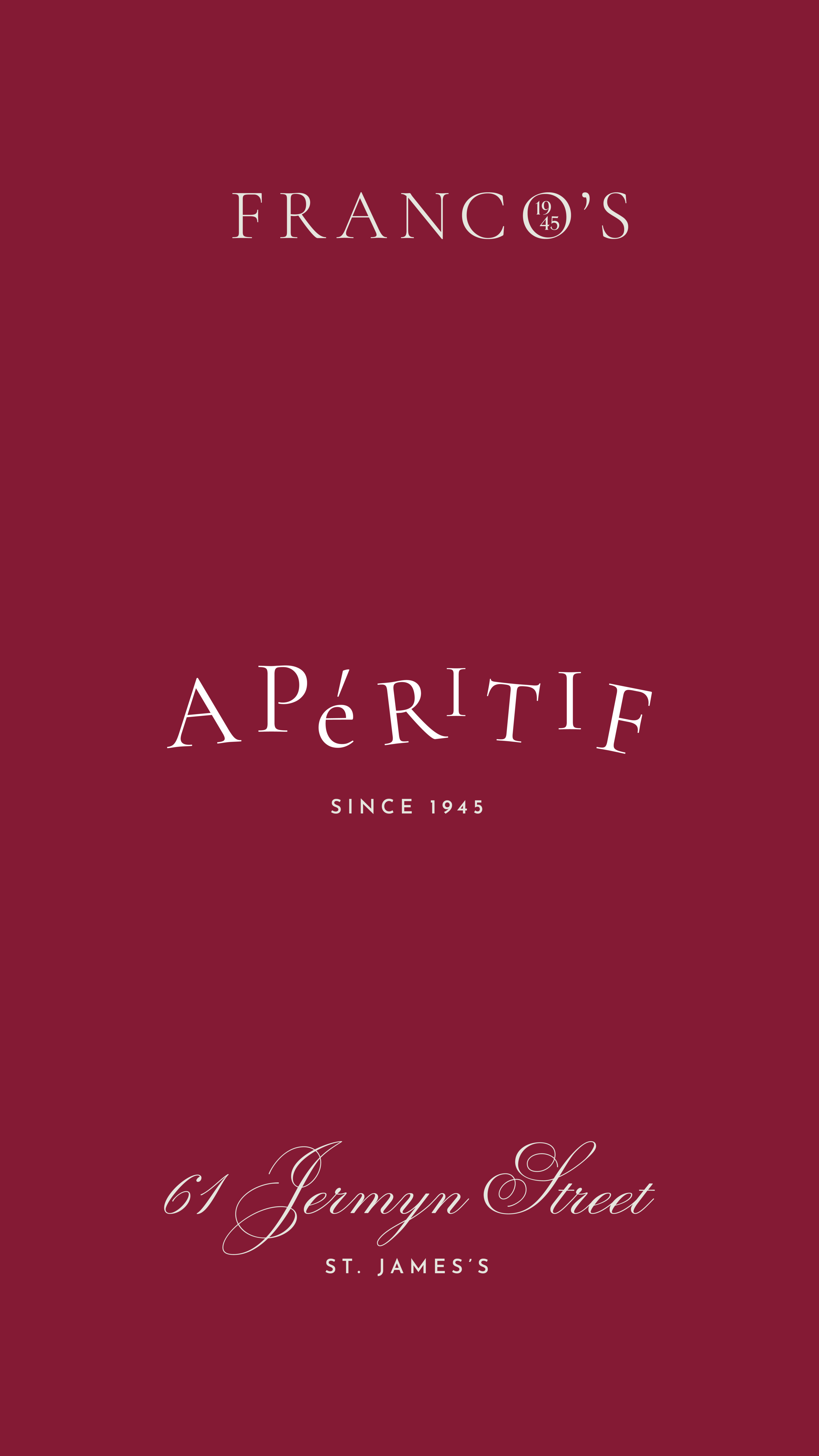
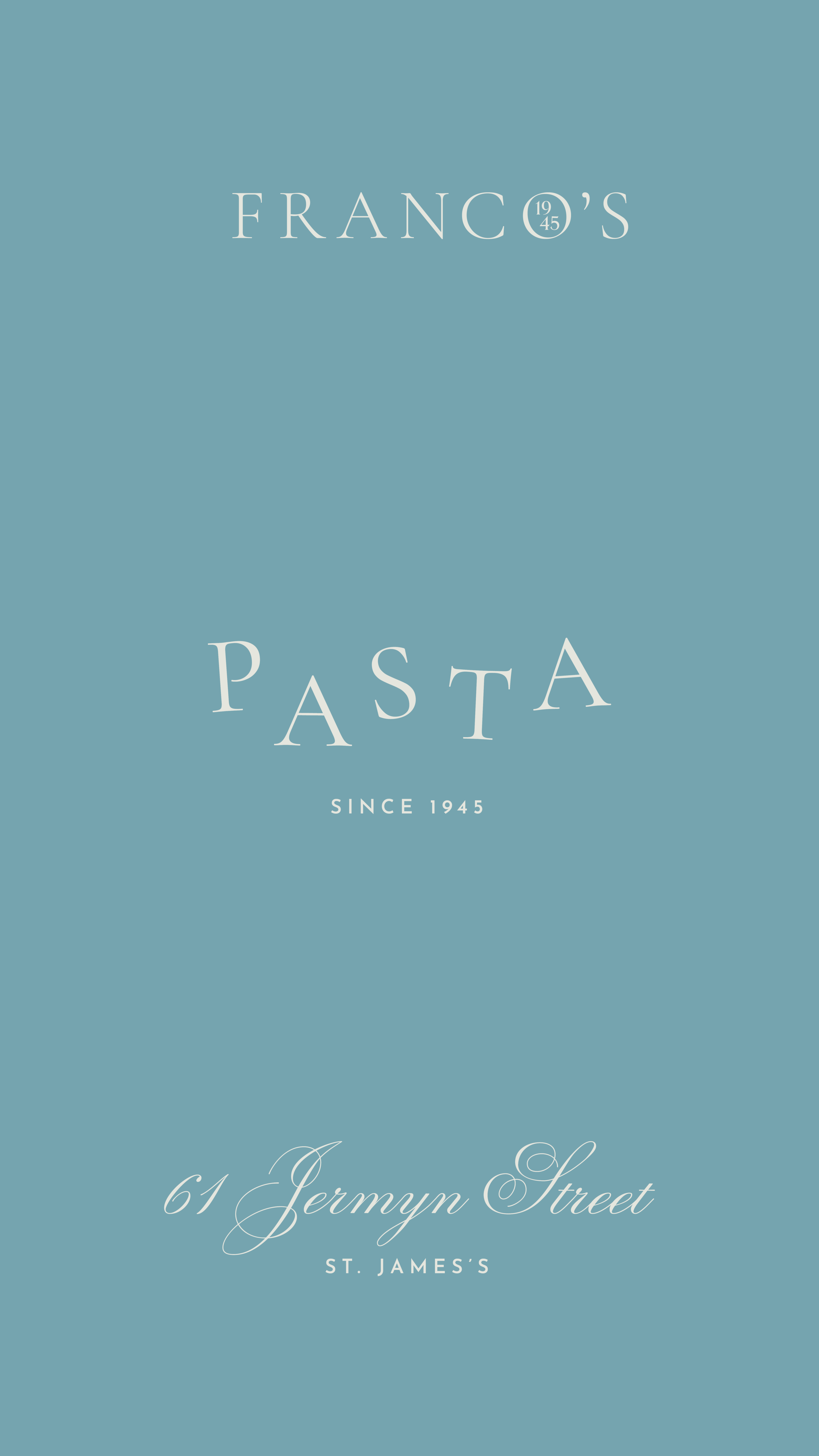
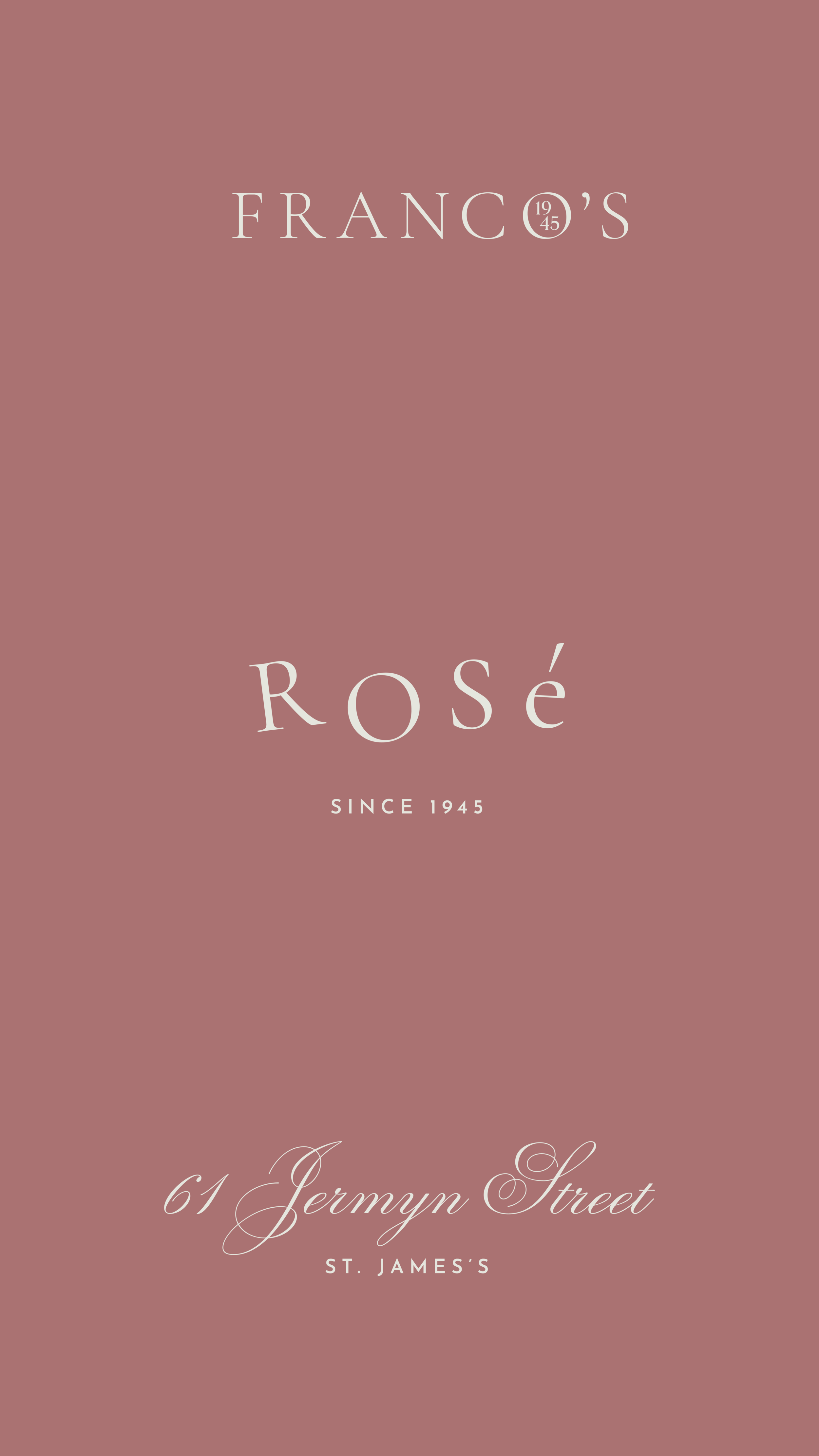
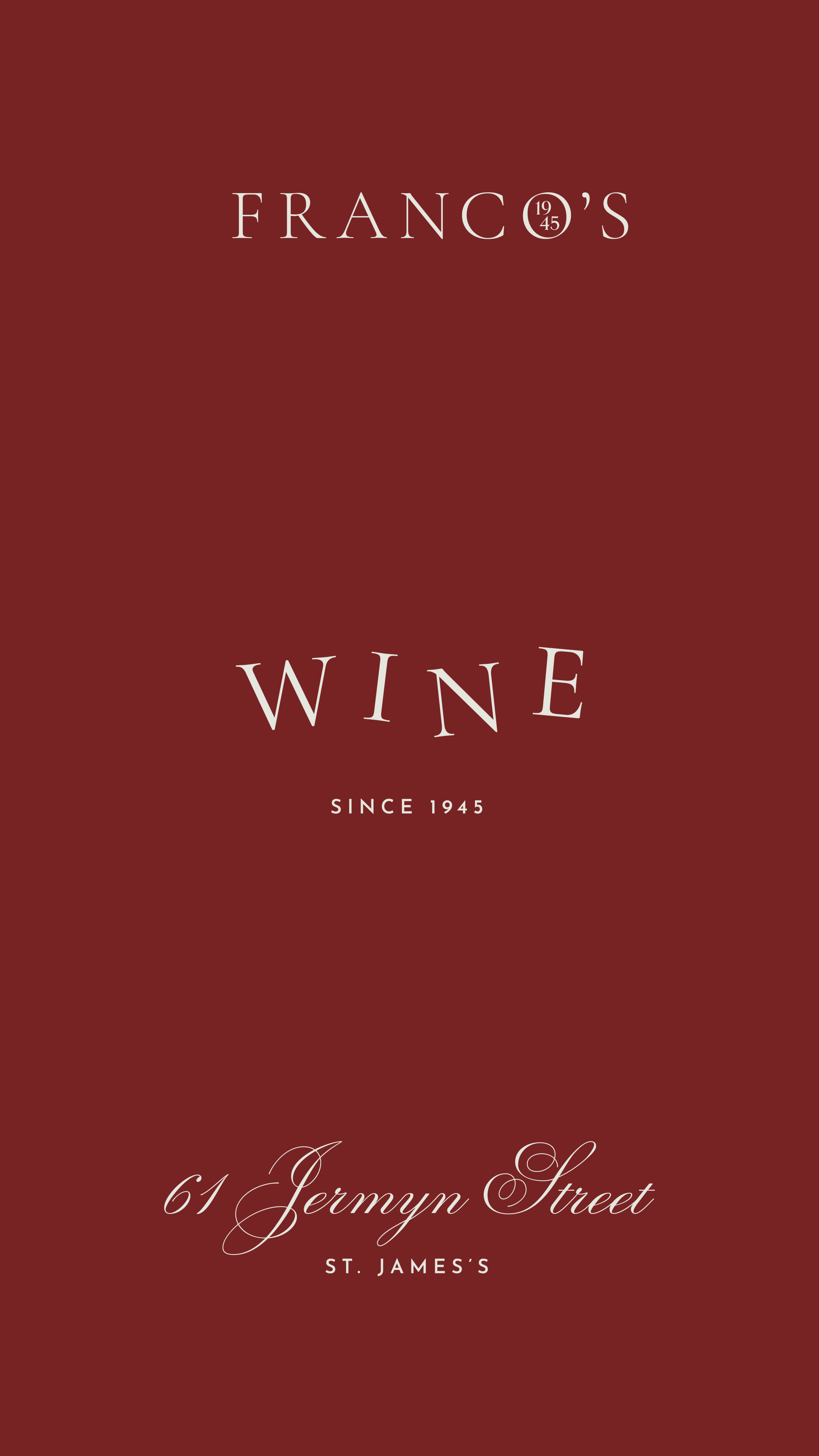
Alongside the visual identity, we also developed a bank of digital assets to be used with specific social media applications. We included a broader and bolder colour palette for social media, which could be used to reflect different elements of the brand.
For example, for story slides, we implemented a more playful take of the new Franco’s typeface, with a scattered letter layout. This helps promote some of Francos specialities, provides a visual break in imagery and injects fun, but still remains timeless, elegant and mature.